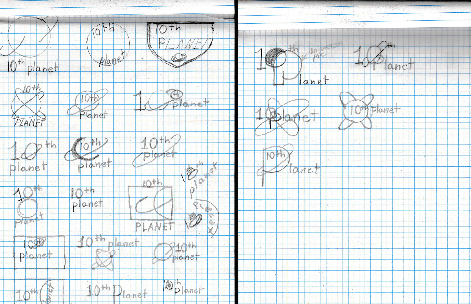
The Drawing Board
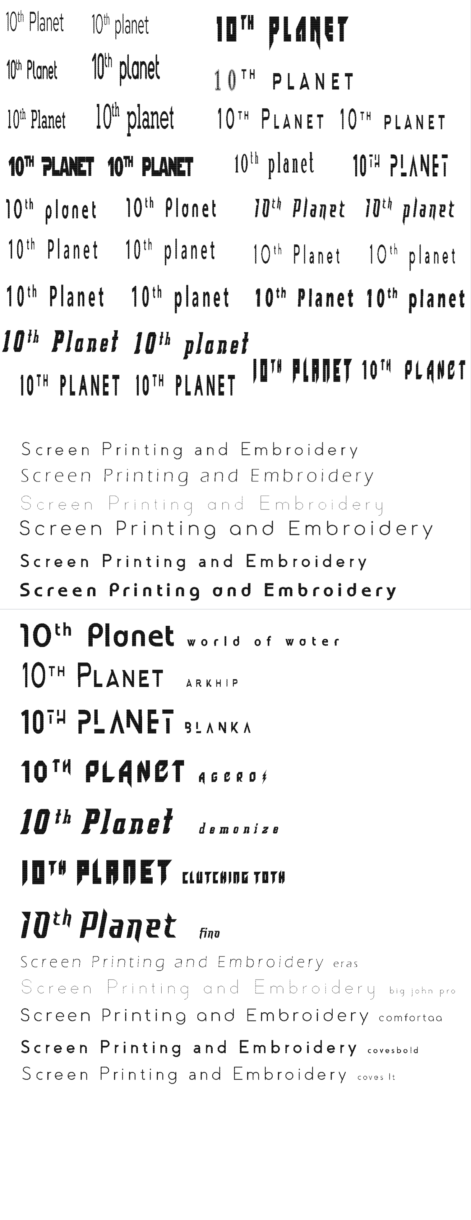
Type Study
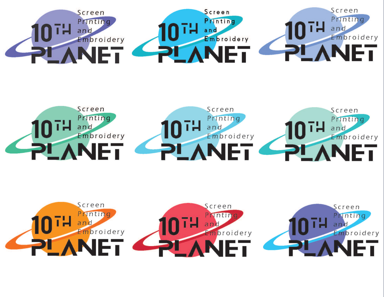
Color Study
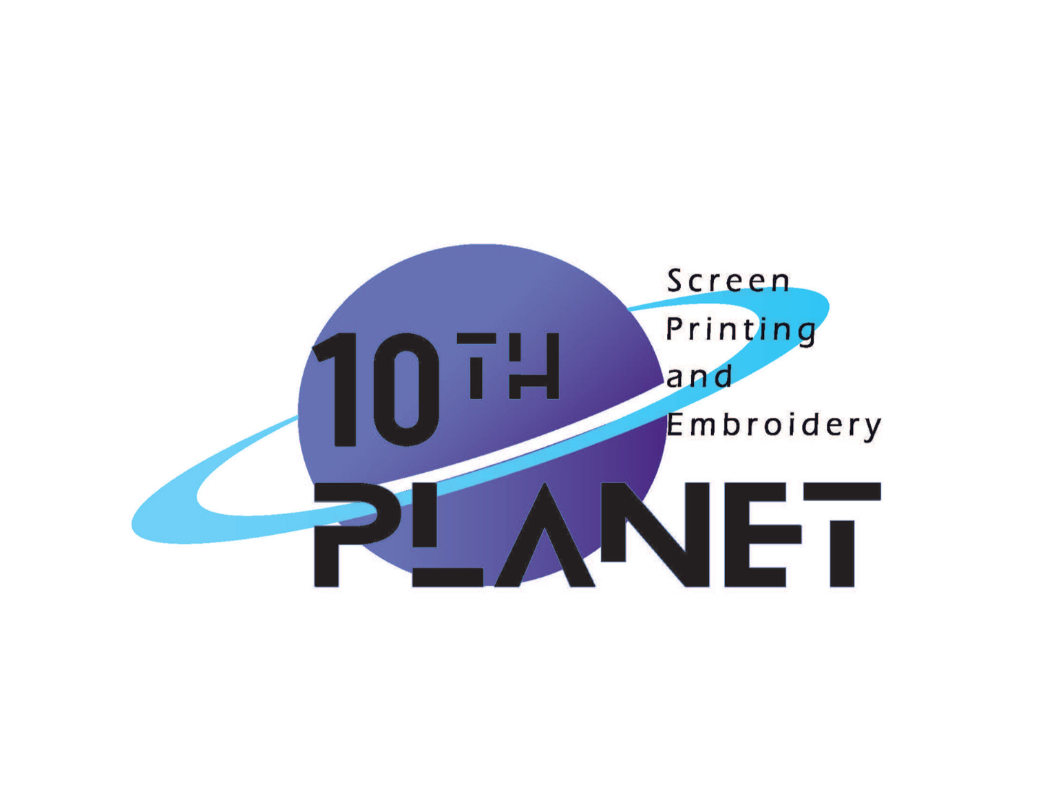
Final Draft
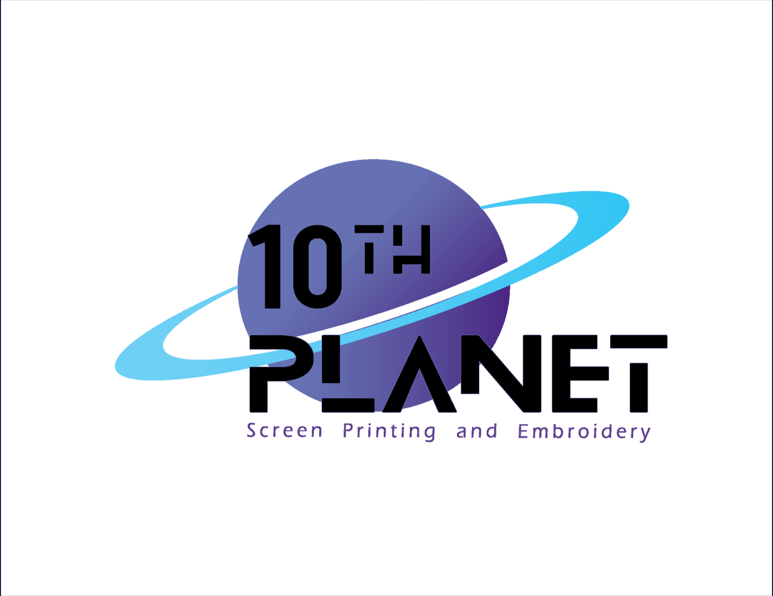
Final Draft (Revised)
Design Process:
The process began with research into 10th Planet’s customer base and industry. I explored logo sketches with planetary and orbital themes to evoke a sense of motion and orbit—symbolizing the brand's ever-spinning creativity. Typography played a key role: I tested bold, structured fonts that maintained readability while holding up well under screen printing.
The process began with research into 10th Planet’s customer base and industry. I explored logo sketches with planetary and orbital themes to evoke a sense of motion and orbit—symbolizing the brand's ever-spinning creativity. Typography played a key role: I tested bold, structured fonts that maintained readability while holding up well under screen printing.
Key Decisions:
Visual Concept: Rounded, orbital forms to represent continuous movement and forward momentum
Typography: Strong sans-serif font for clarity and durability in print
Color Exploration: Multiple color variations to ensure adaptability across apparel and marketing material
Final Mark: A clean, modern logo that’s print-friendly and versatile across digital and physical platforms
Tools Used: Adobe Illustrator, Photoshop, Sketchbook