


Design Approach:
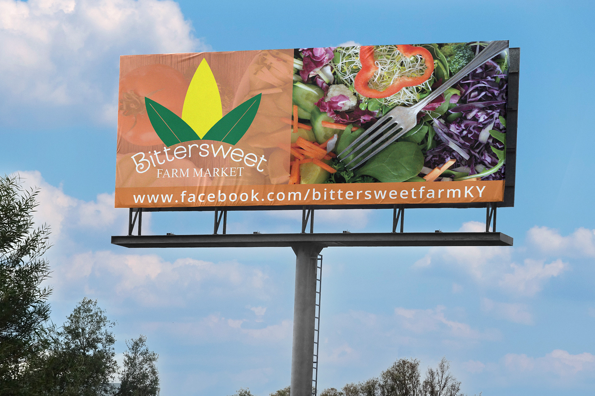
I drew inspiration from hand-lettered signage and vintage seed packets to give the materials a nostalgic, down-to-earth feel. Earthy tones and organic textures helped reinforce the authenticity of the brand. Typography was selected for its readability and warmth, while spacing and layout kept the design clean and accessible.
I drew inspiration from hand-lettered signage and vintage seed packets to give the materials a nostalgic, down-to-earth feel. Earthy tones and organic textures helped reinforce the authenticity of the brand. Typography was selected for its readability and warmth, while spacing and layout kept the design clean and accessible.
Key Skills Used:
Visual branding for local identity
Print layout and composition
Color theory for emotional tone
Typography pairing for readability and charm